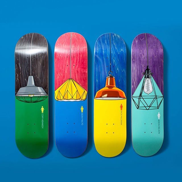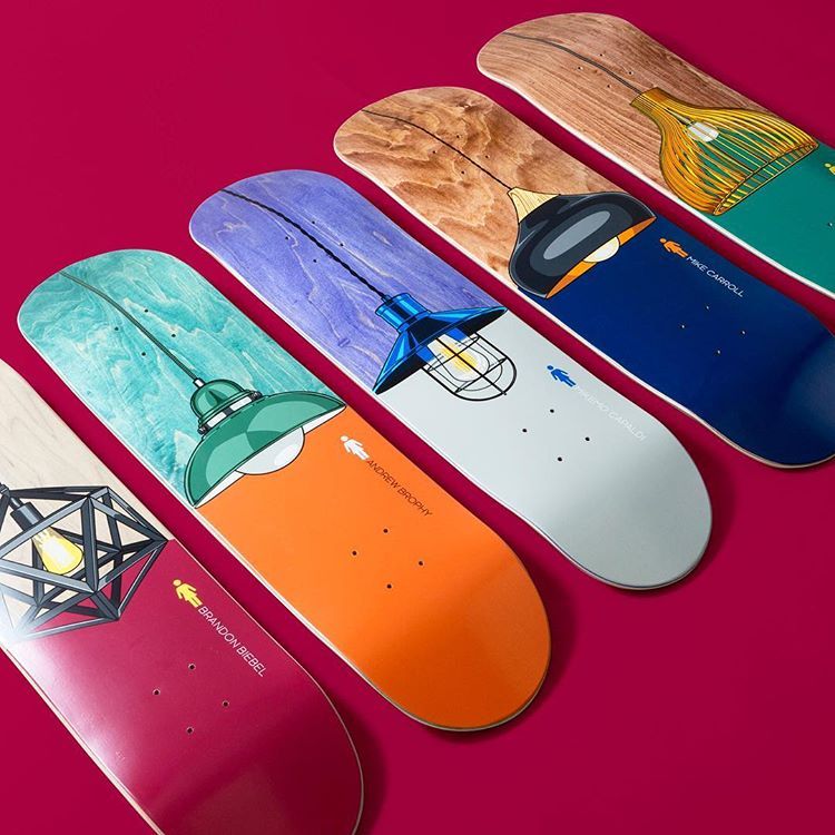
It’s not the first time you had your work used for Girl Skateboards’ graphics, right? What’s the process that’s involved, and how did this particular project come about?
Yeah that’s correct, the first time was the Letterbox series that came out early 2017, I actually designed them about 3 and a half years before that, they didn’t get used straight away. It was a big deal for me to have those come out, I never thought Id get the chance to do board graphics with Mike Carroll and Rick Howard’s names on them, those guys are legends. I did have a board come out a year or two before, that was a collab with Girl and the skate store ‘The Good Room’ which I own with my partner Hales but I don’t really count that one as its not in their range for the world to buy.
This Illuminated series is my favorite so far. In regards to the process – it varies but usually I come up with the concept and artwork and send it to them to see if they like it. I have been building up a relationship with Crailtap (Girl) for a long time now so I’m not just some one out of the blue sending them artwork. The artwork is pretty much finished before I even show them so I run the risk of spending all that time and it just going to waste. I prefer to show finished work as I don’t feel I can show what it could look like if I just send a rough sketch. I personally like to see it finished, its just how I work, Ill stay up all night till something is finished. If they like it and want to run it then great. Sometimes Ill make changes if requested but this series came out as I originally proposed it.
What was the inspiration behind the lampshade graphics?
With the lampshades I like how they are an everyday object that are a part of everyone’s lives but they are also design objects that can become so iconic. To be honest I spend a lot of to time trying to come up with a graphic subject that hasn’t been done before, believe me that is pretty hard now-a-days.
I look at magazines, books etc away from the skate world for subjects that could be used and could work on the shape of a board. I have been a fan and followed Girl and Chocolate and their Art Dump department from when they started back in 93. Without writing a huge list I really like some of the older graphics, the ‘modern chair’ series Tony Larson did is an obvious standout, how clean it is and the subject seemed more mature and was completely different from anything else at the time.

Do you have a favourite from the series?
Nah I don’t have a favorite from this series, I like them all as a set. Its kinda hard to pick a fav.
What other projects do you have in the pipeline?
I just had a one off board come out for Andrew Brophy on Girl – that’s just delivered to stores in the last few weeks. I’m working on some new concepts but none of those are complete or locked in yet.
I recently finished painting an OG wooden doll for an exhibition Girl are having which is fundraising for the Red Project. That was really cool as this package arrived a few weeks ago with a blank doll and a letter in it. I’m hyped to be a part of that exhibition next to artists/designers that are handpicked and people I have looked up to for a long time.
There are a few board graphics coming out for some other smaller brands and independent skate shops in the US in the near future, also a series of boards done for our store a little later in the year. I always have print designs on the go for clothing companies and other random design jobs. I have ideas for some personal projects but struggle to find the time to get to work on them, I’m planning on making more time for that.


